Product page
Page structure
Section titled “Page structure”Product information includes the gallery and Purchase information column. In Zenit’s granular composition, this column uses four groups with their own blocks:
| Group | Main blocks |
|---|---|
| Header | Sales quantity, name and SKU |
| Prices and discounts | Prices, payment methods and discounts |
| Purchase form | Variants, stock alert, buy button and shipping calculator |
| Product details | Description, informational icons and additional content |
Essential purchase groups and blocks are protected against removal. Within groups, the editor offers permitted blocks and actions, including supporting text, images and buttons. All Purchase form blocks follow editor order within the same form. For example, an SKU placed before Variants appears there rather than moving after the buy button. Groups also offer the general block catalog, including separator and code.
In the initial Zenit installation, description remains in a section below product information, followed by testimonials and recommendations. Informational icons are in Product details. Adding a description to this group is optional; avoid duplication when the external section is already used.
Local settings
Section titled “Local settings”Configure the gallery
Section titled “Configure the gallery”Click Multimedia in the product page tree. Zenit offers:
- Desktop format: Grid or Carousel.
- Desktop layout: one column, two columns or alternating one and two columns. Appears when format is Grid.
- Element spacing: controls distance between grid media.
- Thumbnails: in Carousel, they can appear on desktop with configurable position, size and rounding. In Grid, they serve mobile navigation only.
- Mobile → Edge-to-edge gallery: removes side margins from main mobile media. This control is independent of thumbnails.
A grid with only one photo uses all available width without an empty column.
Sales and promotions appear as badges over the gallery. When both exist, quantity promotion takes priority. Colors follow Badges in global settings. In granular composition, conditions are in Prices and discounts: category application and product combination possibilities form a single message. Products without media retain the custom badge in the information area.
In the older form composition, gifts, free shipping and promotions retain spacing between themselves and variants. On mobile, variants also keep space before purchase controls. Shipping and coupon fields use the theme’s main background color, including when the calculator appears in a card. That card’s header aligns title and description with the postal code field, without a decorative icon. Card height follows the form, entered postal code and error messages, retaining internal padding.
A stock alert without a visible message adds no space between variants and purchase. The main price bold control also applies to subscription price.
Gallery configuration and result
Section titled “Gallery configuration and result”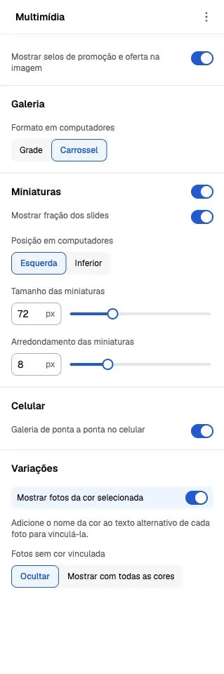
Editor screenshot from October 6, 2026. Open Multimedia to find controls. The example uses carousel; grid-only fields appear when that format is chosen.
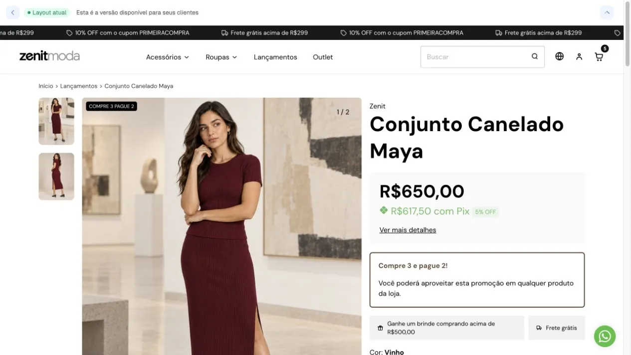
Demonstration store result on October 6, 2026: gallery and purchase occupy separate columns. Product, prices and conditions illustrate this configuration.
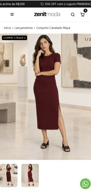
On mobile, the gallery appears before purchase information and thumbnails sit below the main image. Recorded in a 390 × 844 viewport, not on a physical device.
Show photos of the selected color
Section titled “Show photos of the selected color”Enable Show photos of the selected color to display only media linked to the chosen variant. In each photo’s alternative text, enter the color name exactly as registered in the product. The editor also allows defining how to handle photos without an associated color.
Changing the swatch updates gallery, applicable video and pagination together. Test every product color before publishing.
Configure purchase blocks
Section titled “Configure purchase blocks”Select the corresponding block to edit:
- Name: title typography and size, including mobile adjustment.
- Prices: highlighted price, order, main/secondary sizes, bold, background card, Pix icon, colors, previous price and amount saved.
- Payment methods: installments and payment discount percentage display.
- Variants: buttons or list, color photos, swatch/button shape and size, size guide. Button text is centered in the configured height on mobile and desktop.
- Stock alert: threshold quantity, last-unit message and color.
- Buy button: quantity, stock, text, appearance and WhatsApp. The link depends on the number configured in the store.
- Shipping calculator: lookup display and card or compact presentation.
Variant selectors use native buttons: keyboard selection matches clicking without submitting the form. In Buy button, secondary style inherits corresponding theme colors when the block has no colors of its own.
For subscription products, previous price and discount message also receive typography configured in Prices. Subscription availability depends on Nuvemshop enabling the feature. The integration still awaits validation with subscription products enabled.
Sticky purchase is in Purchase form group settings. General column spacing remains in Purchase information.
Payment-discount price appears only when the store and product offer it. If this price is chosen as the highlight but no discount is available, the main price takes the highlight.
View more details opens the store’s payment methods and installment conditions. The modal combines each method’s logo/name in a card, with the highlighted total on the right on desktop and below identification on mobile. Discounts appear beside the name; conditions are separated by a subtle line. The table uses alternating rows to compare installments. On mobile, conditions scroll within the window; the header and return to product are separate from that scrolling. Provider names, discounts and notices follow platform data. This also works in older four-block compositions; migration is not needed to consult installments.
Quickshop and featured product
Section titled “Quickshop and featured product”The old global Product form group was removed. The product page uses its own block settings.
Quickshop has independent variant and stock controls in Global settings → Product card. Card payment-discount price and stock messages remain in that area.
Featured product, used on the home page, now offers its own media and information blocks. It retains selection of the first product in the featured list or a random product from that list. Changing its blocks does not change the product page or quickshop. Sticky purchase is not used in this section.
Recognize the store form
Section titled “Recognize the store form”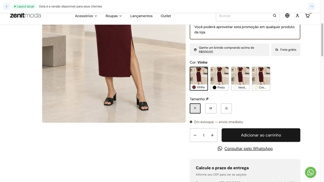
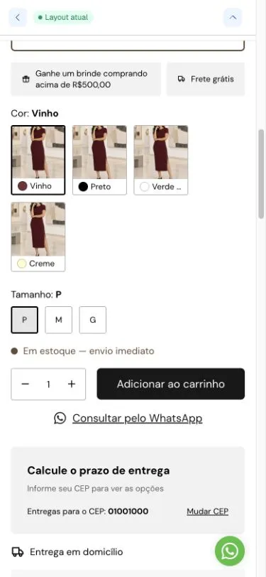
Screenshots from October 6, 2026. Colors, sizes and availability come from product data. The example shows color photos and size buttons; other formats depend on local settings. On mobile, observe option wrapping and buy button readability. Screenshots record presentation rather than completion of an order.
Updating existing installations
Section titled “Updating existing installations”Default templates already use the new composition. A custom installation requires migration of saved values before removing old settings. Code retains rendering of previous formats for compatibility; this does not replace conversion of each installation’s data.
Product page videos
Section titled “Product page videos”Floating shoppable video uses the first native product video when enabled in the template. Shoppable video carousel can be added separately to the product or home page and also accepts external videos.
Checks after editing
Section titled “Checks after editing”Test products with and without variants, availability, price and discounts; also open quickshop and check the cart. Check desktop and mobile. Kits and subscriptions retain their contracts but require their own validation round.
Color swatches follow theme rounding: internal fill uses a smaller radius according to border inset, keeping corners aligned. The circular option retains its circular shape.
Promotion conditions and benefits
Section titled “Promotion conditions and benefits”Promotion conditions can be reordered in Purchase information or Prices and discounts. It displays automatic promotion conditions in a frame bordered with the accent color, with editor-configurable presentation. Spacing and Element spacing adjust padding and content distance. Text and commercial rules come from store promotions, not free block content.
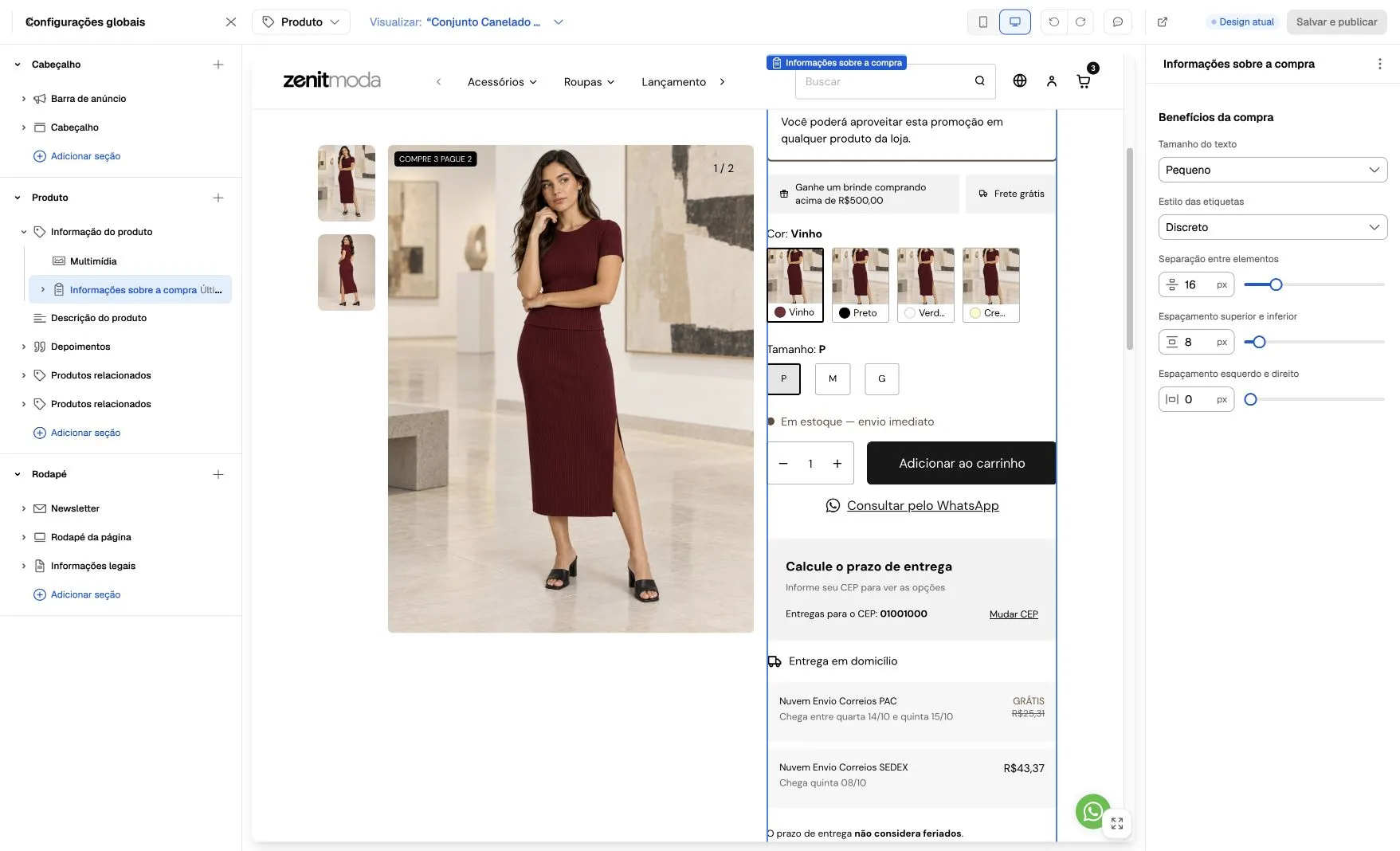
Screenshot from October 6, 2026 in an existing composition: Purchase benefits appears as a control group in Purchase information. In granular composition, open the dedicated benefits block. Use the actually saved store tree to locate the control.
Gift and free shipping appear as badges on the same row when space permits, automatically wrapping on narrow screens. Minimum conditions and combination restrictions remain displayed.
In Global settings → Product card → Free shipping badge, choose Icon + Free (default) or Text: Free shipping, without icon. This affects product cards and preserves colors configured in Badges.
Text size offers small, medium and large in Promotion conditions and Purchase benefits. In Badge style, choose Subtle (default, soft background), Accent (theme accent color and contrasting text) or No background. Text and icons follow the chosen style without individual color selectors. Purchase benefits is independent and reorderable. Options and purchase keeps its position locked with editable settings. Form and purchase controls have no divider lines; separation comes from block and variant spacing.
In Promotion conditions, Presentation allows Simple or Card. Show condition description is independent: when disabled, only the promotion title appears. Default remains card with description; padding applies to the card and spacing to the description.
In Price and payment conditions compositions, subscription price follows main price size, color and weight. When payment-discount price is highlighted, subscription follows the main price’s secondary size. Subscription discount color follows discount settings.
In Multimedia, use Show promotion and sale badges on the image to control gallery commercial badges; unavailability notices remain independent.
In Options and purchase, Show in-stock product message displays “In stock” and follows variant availability. It is separate from last-unit and low-stock alerts. This composition no longer shows “Available” below quantity. Where unit counts can be displayed, the row hides when stock has no numeric limit.
Editorial list is a Zenit block available inside Image with text content. It is not offered in the product page block-add menu.
In Price and payment conditions, the card includes prices, installments and View more details. Displaying the percentage beside payment-discount price is also available in this composition. When enabled and the discounted price is visible, the repeated discount message hides; restriction notices remain available.