Video gallery
The Shoppable video carousel section brings together vertical cards with cover, product name and price. Opening a card lets visitors watch video, choose variants and quantity and add the product to the cart. Product linking is optional for external videos, also allowing an editorial gallery.
Configure in the new editor (Brand Editor)
Section titled “Configure in the new editor (Brand Editor)”- Open the home page or a product page template and select Add section → Shoppable video carousel.
- Add heading/text blocks as needed. Configure background/text colors, visible desktop quantity and vertical spacing. Choose left or centered alignment (centering only when free space exists, preserving scrolling). Drag the section to the desired position.
- In each Video with product block, enter the Product ID to associate a catalog item. Copy only the number from the product’s admin edit address. Name, price, availability and variants are retrieved from the catalog; no need to enter them again.
- Choose the source: Native product video uses the first video uploaded to that product’s media; External video allows a YouTube or Vimeo link exclusive to the card. The link field appears only for this source.
- Optionally select a Cover image. Without it, the theme uses the video thumbnail or product image.
- Reorder blocks to define the sequence. The section accepts up to 12 cards. Save and check the preview.
The editor’s product group selector does not offer individual selection in this version, so linking uses the ID. It remains stable when product name or catalog position changes. Text content follows the new editor’s language handling.
The preset starts with three empty blocks. Cards without compatible video show an instruction in the editor and are hidden in the store. A section without valid cards is also hidden in the store.
Playback and purchase
Section titled “Playback and purchase”The gallery shows one card per product, in first-occurrence order. Blocks with the same product ID form a stories sequence; native and external videos can participate in the same group. The first block defines cover, title and purchase configuration. With “Group videos of the same product” enabled, identical videos for the same product are deduplicated. Disable it to show each block as an independent card. External videos without a product remain independent.
On mobile, swipe horizontally through the gallery; on desktop, arrows are also available. The player preserves the chosen product: only arrows, left/right keys or a horizontal gesture switch products. Progress bars appear only for products with multiple stories and allow choosing one. Native and YouTube videos advance automatically only within the group. The last video keeps the product open; “Repeat videos when finished” restarts the same product’s sequence. Opening purchase interrupts automatic advance until a new product is chosen, even after collapsing the form. Vimeo retains provider controls; the theme tracks each story’s progress, resume and end through the player. Gestures over external iframes are not intercepted. Variant selection remains associated with the product while the page is open.
Visible card previews can play muted with on-demand loading. Disable “Play muted previews” to show covers only. Opening a player suspends previews. Native video starts muted when the browser allows; YouTube also starts muted by default. Reduced-motion preferences disable automatic starts. Closing or switching video ends the previous player. Native and YouTube videos resume their position when returning while the page remains open; completed videos restart. Explicit sound choice is preserved during the open page and shared with the floating modal; the floating preview stays muted. Escape closes the modal and returns focus to the card.
The compact product summary overlays the bottom of the video. Tap it to open/collapse variants and quantity with a short transition respecting reduced motion. Variants and quantity use quickshop components; opening options pauses native video. Purchase uses the theme cart. Out-of-stock combinations block the button, and navigation is blocked while an addition is in progress. The platform validates price and stock again at purchase.
Kits and subscriptions direct to the full page. For products requiring custom fields or apps on the product page, disable Allow purchase in video on the card: video remains available with View product details. The theme cannot automatically detect every external app requirement.
On the product page, the carousel can coexist with floating shoppable video. Opening the carousel hides and pauses the widget. Carousel variants do not change the main product selection.
Limits of this version
Section titled “Limits of this version”- Up to one optional product per video. “Shop the look” is not included.
- Native upload is done in product media, not the carousel block. There is no second-native-video selector per card.
- External links are YouTube/Vimeo; direct MP4 URLs, TikTok and Instagram are not accepted sources.
- YouTube uses
controls=0andrel=0, but title, branding, ads and recommendations cannot be fully eliminated. - External videos must allow embedding. Restrictions, ads, cookies and player messages are defined by the provider.
- Native player failures offer retry; external videos also display provider messages. The product page link remains available.
- Playback progress is not synchronized between carousel, gallery and floating widget.
Playback controls
Section titled “Playback controls”For native video, click or tap the image to pause/resume. The central icon appears when paused, and volume remains on a separate button. The image control also supports keyboard interaction. YouTube videos use their own player controls, without theme duplication.
Gallery options
Section titled “Gallery options”“Video name (optional)” identifies video for accessibility; it does not replace the product name. Without it, the product name is used.
“Circular navigation” works with at least four displayed cards and enough content to scroll: the arrow returns from end to beginning (and vice versa). It does not duplicate forms or create a continuous clone loop. The player’s numeric counter was removed; progress appears only in groups with multiple stories.
The “Featured videos” preset offers a light background, dark text and four blocks to configure. The dark preset remains available. Both preserve settings of modules already added. Section content uses native editor groups, headings and text, like theme product lists.
Show video numbering controls numbers on cards and is enabled by default. The decorative play icon was removed; clicking a card still opens the player.
Preview controls and providers
Section titled “Preview controls and providers”Each card has a Play/Pause button in the upper-right corner, with a translucent background and 36px circle (44px interaction area). It controls only the preview, without opening the purchase player. The rest of the card opens the player. Individual pause persists when navigating the carousel; while the preview player remains loaded, it resumes at the same point. Leaving the visible area unloads the player: pause remains, but later playback may restart. The collective “Pause previews” control was removed. With reduced motion or autoplay disabled, visitors can still start each preview through the button.
Vimeo also integrates progress, resume and pause when purchase options open. External videos retain provider controls; privacy and embedding restrictions still apply.
Featured videos inherits store colors when local colors are empty. The dark preset keeps explicit colors. Saved settings are not replaced.
Navigation and purchase access
Section titled “Navigation and purchase access”The gallery uses the theme’s Swiper for dragging and 300ms transitions. When all cards fit, arrows are hidden and configured alignment is preserved. With four or more cards and scrollable space, circular navigation returns to the opposite end through arrows without clones. Manual navigation retains animation even with reduced motion, while that preference prevents automatic video starts. Each card retains its number during navigation according to configured order after grouping.
The product summary offers the tertiary Choose options action for products with variants, or Buy for those without variants. Confirmation remains in the form. Size labels are centered with a minimum 44px-high area, and top player controls use a dark background to remain readable over light videos.
Width and mobile cards
Section titled “Width and mobile cards”In Design, choose Page width (theme default) or Full. At full width, horizontal spacing is configurable. Videos visible on mobile accepts 1, 1.5 (default) or 2; it controls how many appear at once without limiting the registered total. On desktop, Videos visible on desktop allows 2 to 6, default 4. With fewer videos, cards keep the size corresponding to the chosen quantity and configured alignment without duplicating content. With two cards, the summary stays compact and omits the bag icon to preserve the price.
On desktop with a mouse, play/pause appears on hover or keyboard focus. When paused, it remains visible. On devices without hover, it stays visible.
Settings organization
Section titled “Settings organization”- Content: add native heading, text or group blocks before/after videos.
- Layout: alignment, visible desktop quantity, visible mobile quantity, grouping by product, numbering and circular navigation.
- Video properties: preview playback and video repetition in the player.
- Design: section width and vertical/horizontal spacing.
- Colors: background and text.
Reorganization preserves IDs, defaults and saved settings.
The old pixel-width setting is no longer used. Persisted old values are not deleted, but the gallery uses four columns until a quantity is chosen.
Content and arrows
Section titled “Content and arrows”Heading and description are native editor blocks, with their own typography and alignment options. The gallery appears at the first video block’s position; remaining videos make up the same strip. Position headings, text or groups before the first video or after the videos to compose the section. Presets include an editable heading. Old fixed heading, supporting text and accent color fields are no longer used; saved values are not deleted.
Arrows use the shared product list component, on the sides of the strip, with size, color, icon and visibility defined by the theme.
Editor examples
Section titled “Editor examples”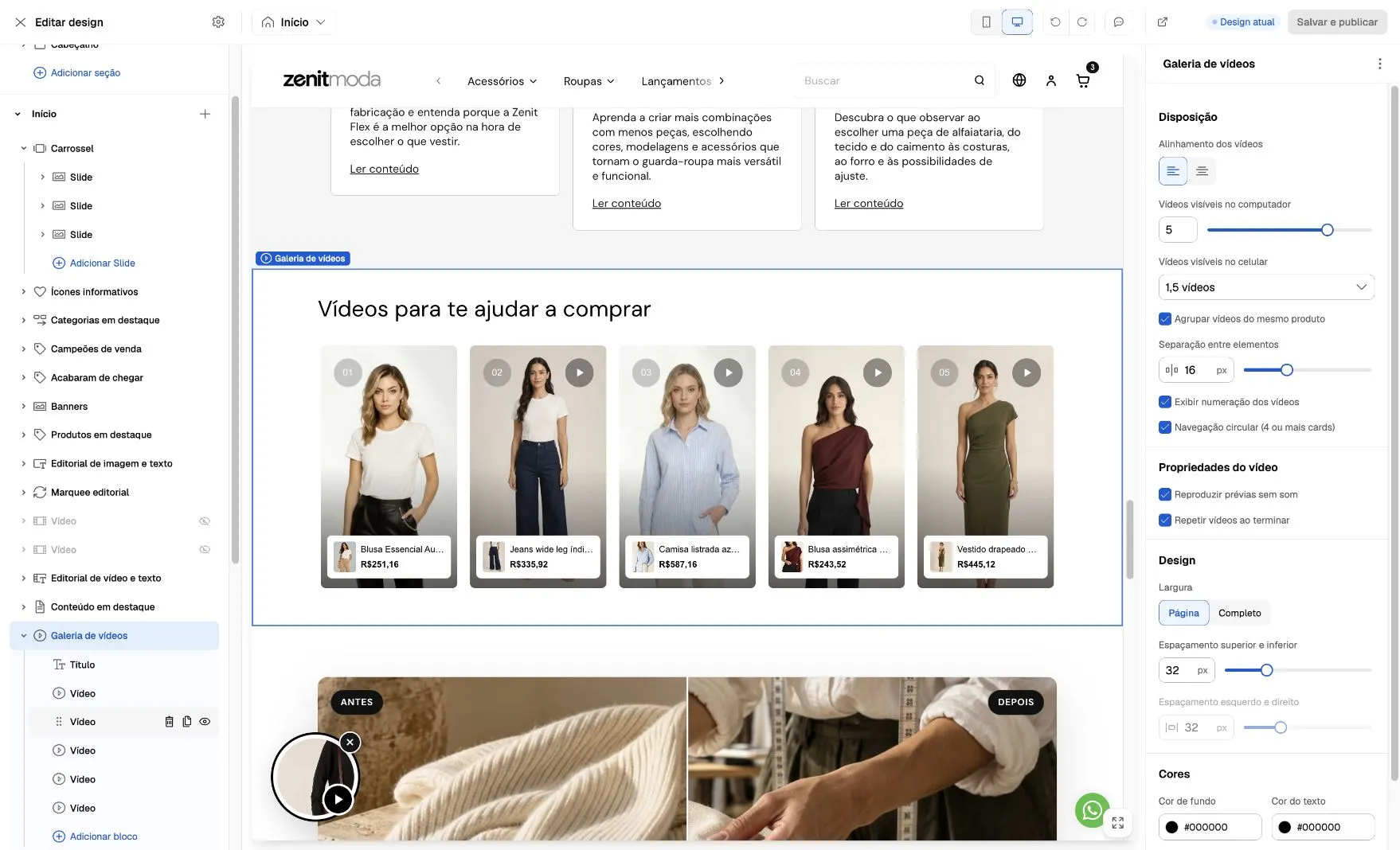
In this example, the section is configured to show five videos on desktop. Select Video gallery to adjust presentation and each Video block to configure media and the associated product.
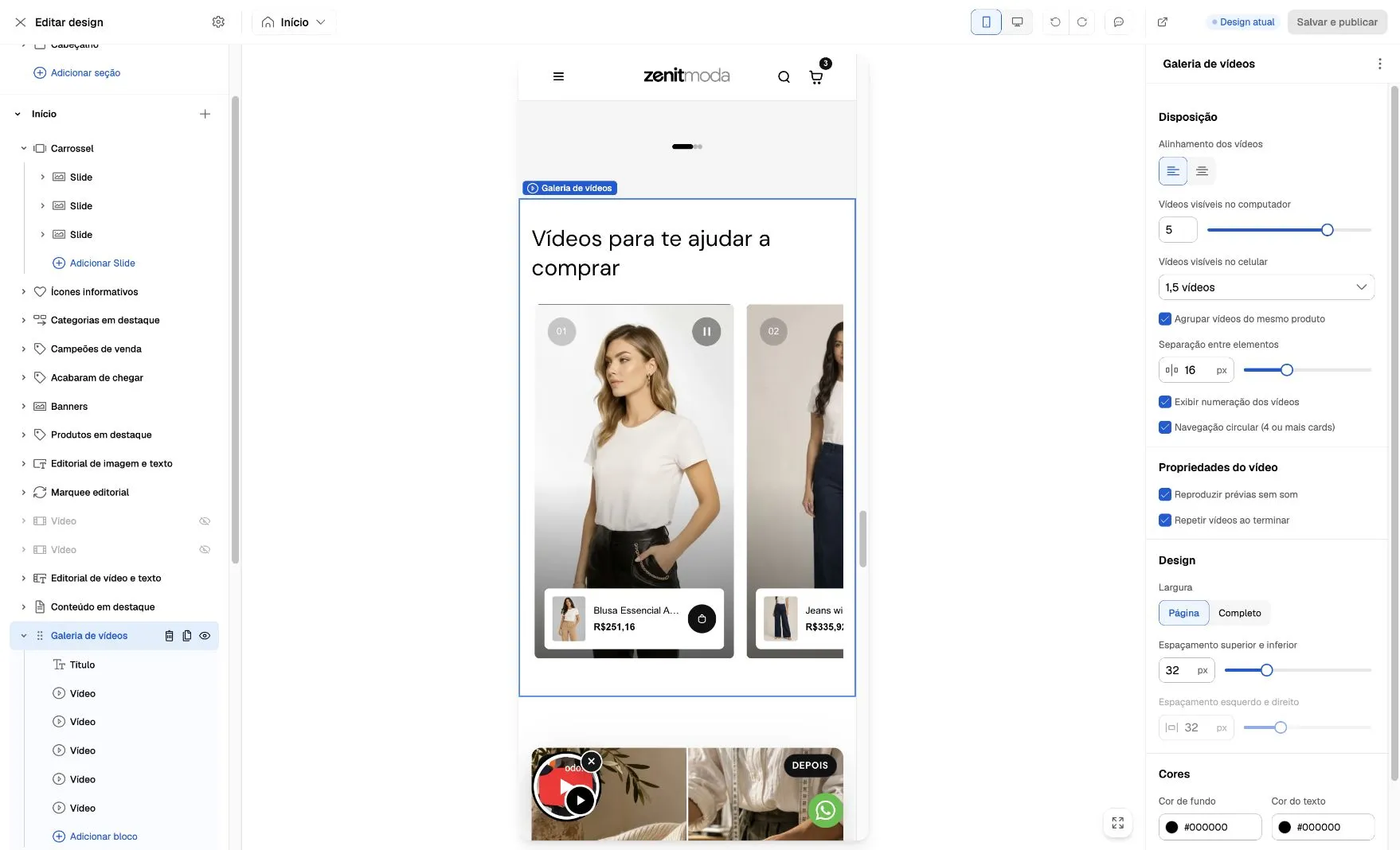
Use Mobile at the top of the editor to check the result. 1.5 videos shows one complete card and part of the next; it does not limit the registered total. Screenshots from October 6, 2026, with demonstration content and custom settings.