Product card
The card summarizes a product in featured lists, categories and search. Configure it under Global settings → Product card. Product selection, column count and grid/carousel layout belong to the list or featured section; the card controls how each item appears.
Compact cards in other areas may omit installments, labels, variants and quick shop. Changing the card does not change product page blocks. See Featured products, Catalog and search and Product page.
Layout and appearance
Section titled “Layout and appearance”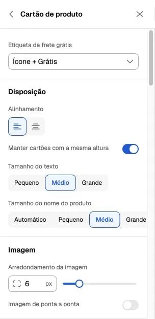
Real Portuguese interface captured on October 6, 2026. The values belong to a configured store and are not the initial values of every installation.
| Control | Options and effect |
|---|---|
| Alignment | Left or center for card information. |
| Equal height | Makes cards uniform; when disabled, allows natural heights according to content. It does not make product names equally long. |
| Text size | Small, medium or large. The name also offers Automatic, in addition to its own three sizes. |
| Image rounding | 0–32 px; separate from global Surfaces and button rounding. |
| Edge-to-edge image | Removes the image inset inside the card; check it with borders and spacing. |
| Inner spacing | 0–24 px. Spacing between cards belongs to Product list or the featured section. |
| Border | Enable it to reveal color and thickness of 1–2 px. |
Photos and effects
Section titled “Photos and effects”Choose Original, 1:1, 4:3, 3:4, 2:3 or 9:16. Original follows the image ratio; fixed formats standardize the area and may crop the photo. Review products with different framing on desktop and mobile.
The second photo on hover requires an additional catalog image and a pointer device. Image effects offer None or Soft zoom; zoom ranges from 102–112%. Do not rely on hover alone to communicate essential information on mobile.
The photo carousel inside each product works in category and search grids, with additional images. It does not apply to home featured lists, product carousels, compact cards or results with a variant selected by a filter. Photo carousels and product carousels are separate features.
Prices and labels
Section titled “Prices and labels”| Control | Capability and dependency |
|---|---|
| Installments | Shows installment information; depends on payment terms available for the product. |
| Featured price | Main price, payment discount or installments. If the discount or installments are unavailable, the main price becomes featured again. |
| Price colors | Enable Customize color in each group to reveal the picker. Discount color also depends on displaying the payment discount. |
| Payment discount | Shows the discount supplied by the platform. It does not create a discount rule or configure Pix or another payment method. |
| Promotional labels | Below or over the image; over the image, choose top or bottom. Content depends on catalog promotions. |
| Free shipping | Icon + Free or Free shipping text. Eligibility comes from the product/platform; choosing a format does not grant free shipping. |
Colors, filled/outline style and corners of primary and secondary labels belong to Global settings → Labels. See Other global controls. Subscriptions may use their own price presentation; do not assume the composition of a regular product.
Brand, colors and sizes
Section titled “Brand, colors and sizes”- Brand: appears only when registered for the product.
- Colors: enable variants and choose over the image or below information. They depend on recognized catalog variations; the selector does not create colors or variant photos.
- Sizes: enable display, then separately one size and sold-out sizes. The theme recognizes variations named tamanho, size, talle or talla. Up to four options appear directly; with more than four, it shows three and an indicator for the remaining options.
Sizes on the card are a summary rather than the complete selection form. Check availability on the product page or in quick shop. Stock and photos must be correctly associated with catalog variants.
Quick shop and button
Section titled “Quick shop and button”Enable Allow quick shop and choose Below or On image. Below, the panel offers button and text size, custom text, icon, background/text colors and a border with color. On image uses a compact action; controls specific to the lower button are hidden.
The quantity field appears only below the information, for an available product with a price, without variants or subscription. Products with variants open quick shop to select options; simple products may add directly to the cart. Subscriptions lead to the product page. Kits do not offer this card quick shop. An unavailable action does not allow purchase when stock or price is missing.
Custom text applies to the regular purchase action; states such as sold out or subscription have their own messages. See the quick shop guide before testing any cart addition.
Quick shop form
Section titled “Quick shop form”In the global card panel, choose a dropdown or buttons for variants. Controls include using the color photo as a button, square/circular shape and color size of 28–60 px; for sizes, 32–72 px and square/rounded/circular shape. Show available stock belongs to the quick shop form.
These choices do not replace local variant controls on the product page or add a size guide to it.
Last units
Section titled “Last units”Enable Last units notice, then set the threshold and message. With known stock of one unit, the custom message appears; for quantities from 2 through the configured threshold, the notice shows the available quantity. Zero, unlimited or unknown stock should not be interpreted as a “last unit”. The notice follows the variant considered on the card; check variants with different stock levels.
Enable the button and choose all products, only in stock or only out of stock. Choose primary, secondary or tertiary style, defined under Buttons. The store must have WhatsApp configured. The action prepares an inquiry with the product name and link; it does not create an order, reserve stock or add to the cart.
Review checklist
Section titled “Review checklist”- Check two names of different lengths, horizontal and vertical images, with and without a second photo.
- Compare regular, variant, sold-out, no-price and subscription products, when available in the catalog.
- Check main price, discount and installments with real data; an enabled visual option does not guarantee available data.
- Compare category, search and home featured lists to recognize where the photo carousel works.
- Review label/button contrast, photo cropping and mobile readability. Check variant stock and the WhatsApp destination.