Brand identity
Brand identity groups visual choices shared throughout the store. A section or block may offer its own settings, so a global change does not always affect every element.
Where to find it
Section titled “Where to find it”- Open the new editor (Brand Editor) and click the Theme settings gear.
- In Brand identity, choose the area you want to adjust.
- Review the effect on the home page, listing, and product page on desktop and mobile.
- Before applying changes, follow Publish changes.
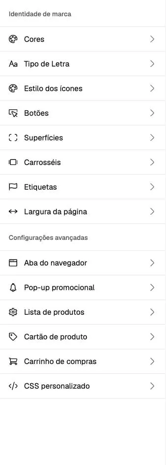
Captured on October 6, 2026. The interface is in Portuguese; translated control names are descriptions. Tipo de Letra is the displayed name for typography controls. The image identifies the groups; it does not show a change applied to the store.
Choose the right panel
Section titled “Choose the right panel”| Panel | What to configure |
|---|---|
| Colors | Global background, text, and accent. |
| Typography | Families, sizes, and bold headings; text and paragraphs. |
| Icon style | Appearance of functional icons. |
| Buttons | Colors, style, and rounding for each variant. |
| Surfaces | Shared rounding for elements that use this setting. |
| Carousels | Appearance of navigation controls. |
| Labels | Appearance of shared labels. |
| Page width | Reference width for content. |
Product card and Shopping cart are under Advanced settings. For logo height, open Logo inside Header; its position is configured in the Header section.
Icon style
Section titled “Icon style”The two styles offer thin, geometric strokes or thicker, rounded strokes. The choice changes search, account, cart, and shipping drawings. Brand, Pix, and WhatsApp logos retain their official designs. Changing the style does not configure an integration or change the control’s action.
When a change does not appear
Section titled “When a change does not appear”Check whether the element has its own color, font, or size in the block or section. A local setting may take precedence over the global choice. Also check the selected device, page, and design; do not remove the section to try to restore inheritance.
Record previous values before adjusting several areas. If the difference persists, follow Troubleshooting and support.