Visual and editorial content
Visual and editorial content
Section titled “Visual and editorial content”The section selector keeps Banners and Grid banners together. Before and after and Blog posts appear further down, separate from basic editorial options.
Banners
Section titled “Banners”To locate image, link, and mobile controls, follow Banners and device-specific images.
Select Banners to configure the group layout. Format allows Grid or Carousel; desktop and mobile columns have separate controls. Image shape and height belong to Design. The two Use a different format on mobile controls act on different areas: group layout and image aspect ratio.
Open each Banner block to check that item’s media and link. Changing section columns does not replace the image registered in each banner.
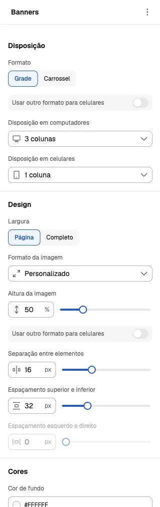
Screenshot from October 6, 2026. The example shows group controls; values belong to a custom composition. Check image crops on desktop and mobile after editing.
Image and text editorial
Section titled “Image and text editorial”The Image and text editorial section brings media and content into one composition. Select the section to adjust width, spacing and colors; open Image with text and its internal blocks to edit content.
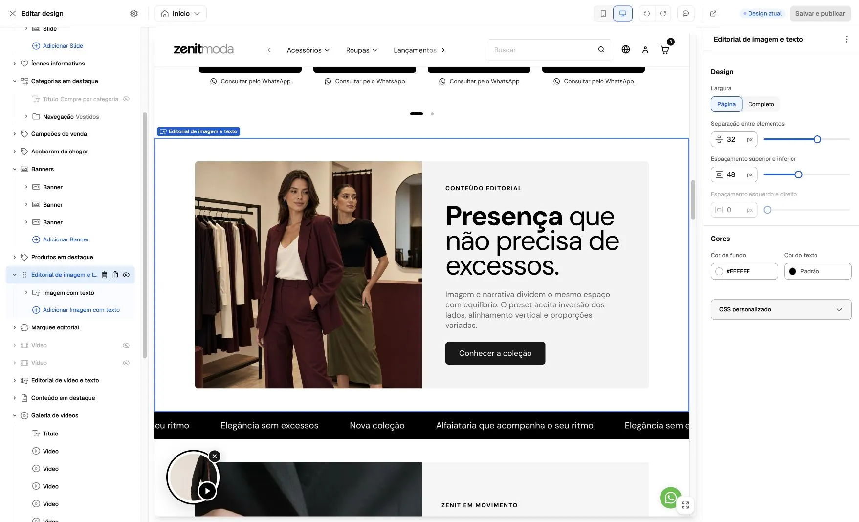
Screenshot from October 6, 2026. The image shows the relationship between the selected section, its controls and the two-column result. Images and text are store examples; mobile layout should be checked in the mobile preview.
Before and after
Section titled “Before and after”The section compares two images through a horizontal control. Height, initial position, divider, handle and badge colors can be configured.
Image background color appears behind the files and is visible in transparent areas. It does not change Before and After badge colors, which have their own background and text controls.
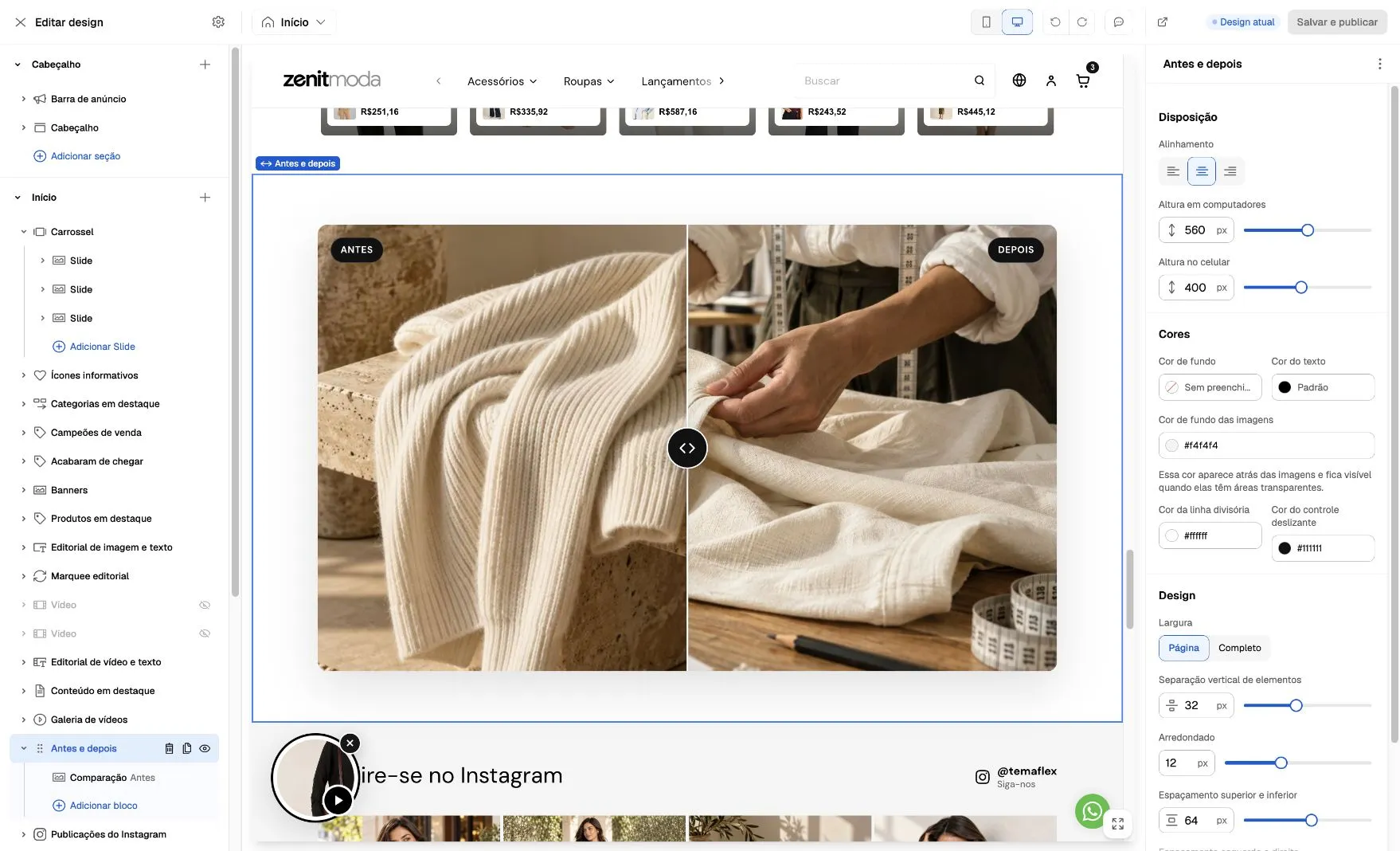
Example captured on October 6, 2026. Select Before and after to adjust presentation; open Comparison to edit comparison content. Images and values illustrate a custom composition.
Editorial list
Section titled “Editorial list”Each card’s content is edited in internal image, heading, text and button blocks. Appearance, aspect ratio, alignment, columns and spacing are set once in Editorial list and apply to all cards.
In the initial installation, Brand blog uses Landscape (4:3) images on both desktop and mobile. This format can be changed in the Editorial list aspect ratio control.
List with markers
Section titled “List with markers”The Editorial list inside Image with text is a list of text items. It supports check marks, bullets, or numbering, with up to eight items. Text stays aligned with its marker even when the rest of the section is centered. This block is separate from the image card list described above.
Featured content
Section titled “Featured content”The Featured articles preset defaults to grid cards: three desktop columns and one mobile column. Each card includes a landscape image, badge, heading, supporting text and link. Clean editorial variations and content over the image are also available.
Cards are manually edited content. A title such as “Brand blog” does not connect the section to registered articles. To select actual blog articles, use Blog posts.
Promotional panel
Section titled “Promotional panel”The Showcase with banner preset starts with a neutral palette: light gray background, dark text and button. Colors remain editable in the block and can be adapted to store identity.
Payment methods
Section titled “Payment methods”The Payment methods in content block is not offered for new additions; older compositions already using it remain compatible. In the footer, use Payment methods within Social networks, payments and security.