Header
The header groups the logo, navigation, and utilities such as search, account, and cart. Announcement and contact bars have their own controls. The composition is shared across store pages.
How to configure
Section titled “How to configure”- In the new editor (Brand Editor) sidebar, expand the Header group and select the Header section.
- Adjust logo position, width, and spacing in the section.
- Open inner blocks to edit logo, menu, and utilities, as described in the table.
- Compare Desktop and Mobile. Open the mobile menu and check a submenu and its links.
- Check the home page at the top and after scrolling, plus a product page. Follow Publish changes before applying.
Section and blocks
Section titled “Section and blocks”| Area | Where to adjust |
|---|---|
| Logo position and separate mobile position | Header section. |
| Logo height and separate mobile height | Logo block. |
| Alternative logo for an overlay header | Logo block; the main logo returns on scroll. |
| Main menu and inline or below position | Navigation block. |
| Search, account, and cart | Utilities block; search is not a separate block. |
| Contacts and social links in the mobile menu | Mobile menu group in the Header section. |
| Promotional messages | Announcement bar section and its blocks. |
| Contacts and auxiliary menu on desktop | Contact bar, when present. |
The Logo block provides the Upload your logo link for the main logo registration. Height changes presentation, not the file. An alternative overlay logo must remain readable over the home page’s first section.
Mobile menu and header on scroll
Section titled “Mobile menu and header on scroll”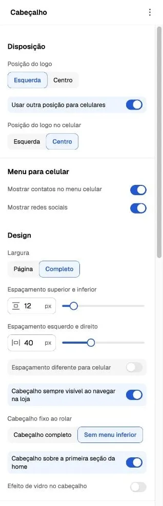
Captured on October 6, 2026. The interface is in Portuguese; translated control names are descriptions. Values belong to the example composition, not mandatory defaults. Show contacts in the mobile menu and Show social networks control whether these details appear; they do not register contacts or social accounts.
Header always visible when browsing the store enables sticky behavior. Sticky header on scroll offers the complete header or no lower menu. Header over the first home section is a separate choice: check contrast at the top and after scrolling.
Colors on scroll configures background, text, and icons for the sticky state. Do not assume changing the top color resolves readability after scrolling.
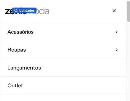
Crop of the editor’s mobile preview on October 6, 2026. It shows the open menu; the blue indicator belongs to the editor. Contacts and social links are outside this crop. This is not a physical-device test.
Announcement bar and navigation bar
Section titled “Announcement bar and navigation bar”Each announcement can have text, a link, and an icon; size and color apply to the group. Review long messages and destinations on mobile.
The Navigation bar section is an independent modular strip that can group menu, contact, social links, and announcements within a page’s content. Its settings do not replace those of the shared header.
When the result differs
Section titled “When the result differs”If the menu is wrong, check the menu selected in Navigation and its platform configuration. If contacts are missing, check registration and mobile menu visibility. If logo or icons lose contrast, compare the top, overlay, and scrolling colors.
The contact bar may be omitted when no applicable content exists. For general preview/storefront differences, use Troubleshooting and support.